Robert Boyd
This is part 2 of my interview with Wes Hicks about the origins and early years of the Commerce Street Artists Warehouse. In part 1, Hicks discussed the very beginnings of the art space. In this part, I wanted to look at some of the artists who had spaces there or who were just hanging out a lot.
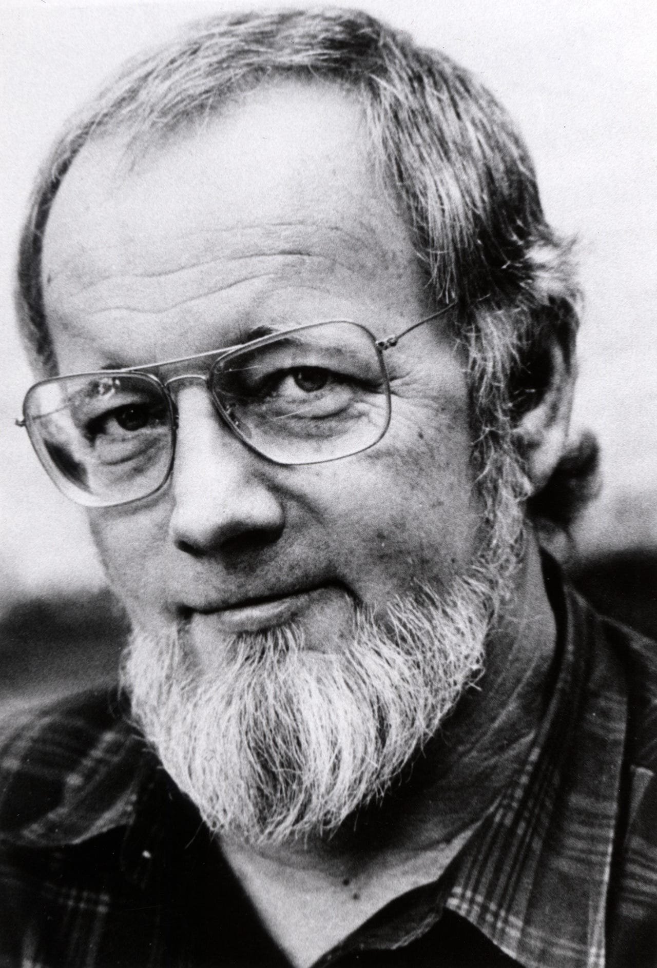
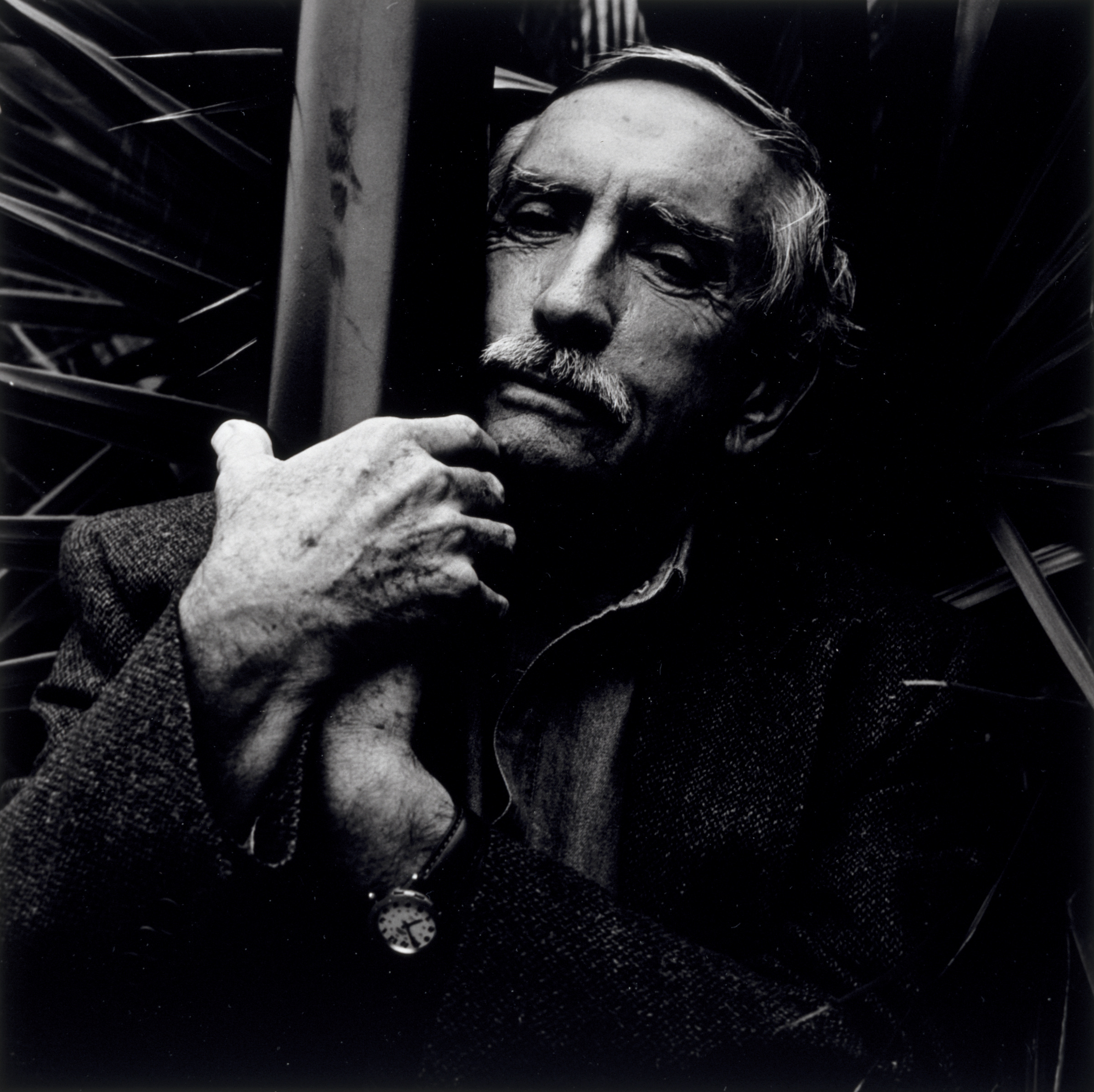
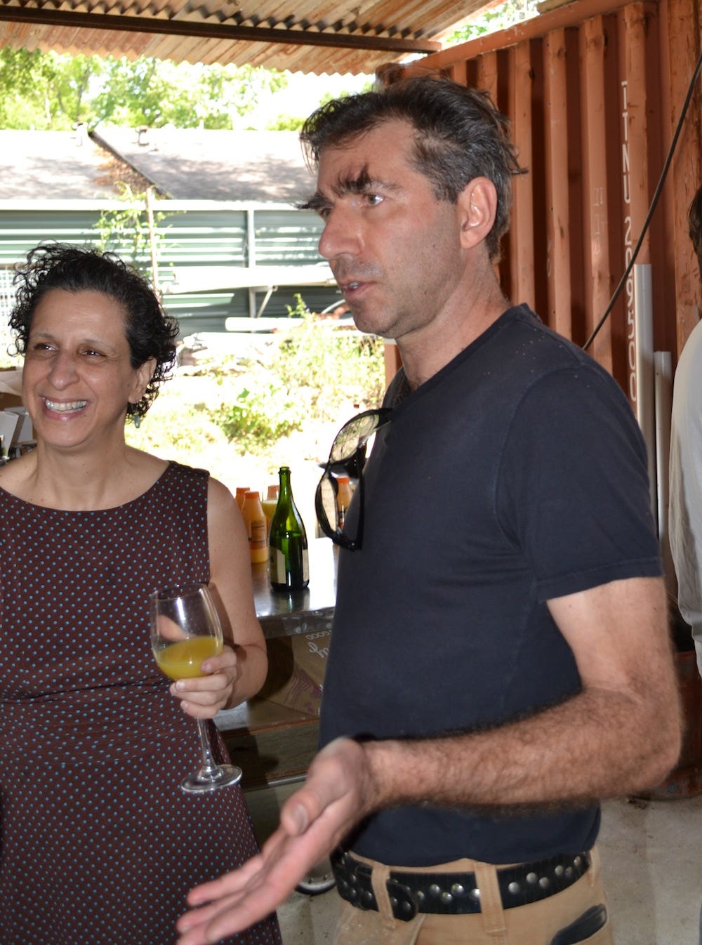
ROBERT BOYD: Now I want to ask about specific people. You've already mentioned a bunch of them. I just want to get from your point of view capsule biographies of them. I'm going to start with Robert Campbell. I know he was a neurologist and did a lot of community work.
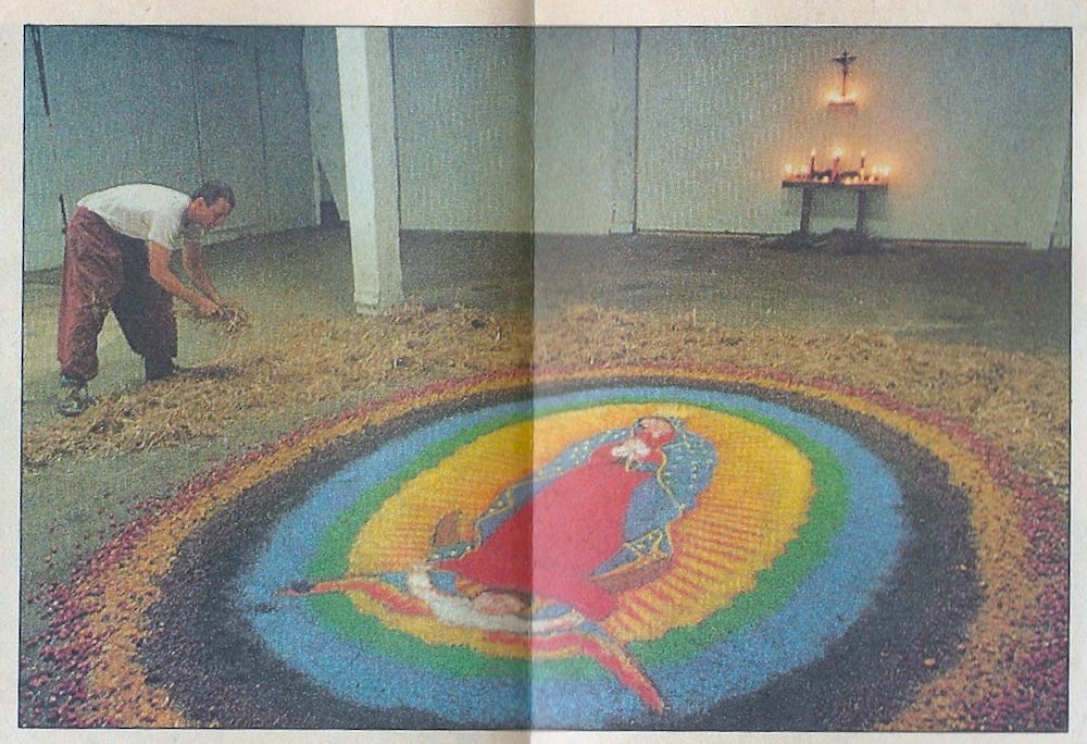
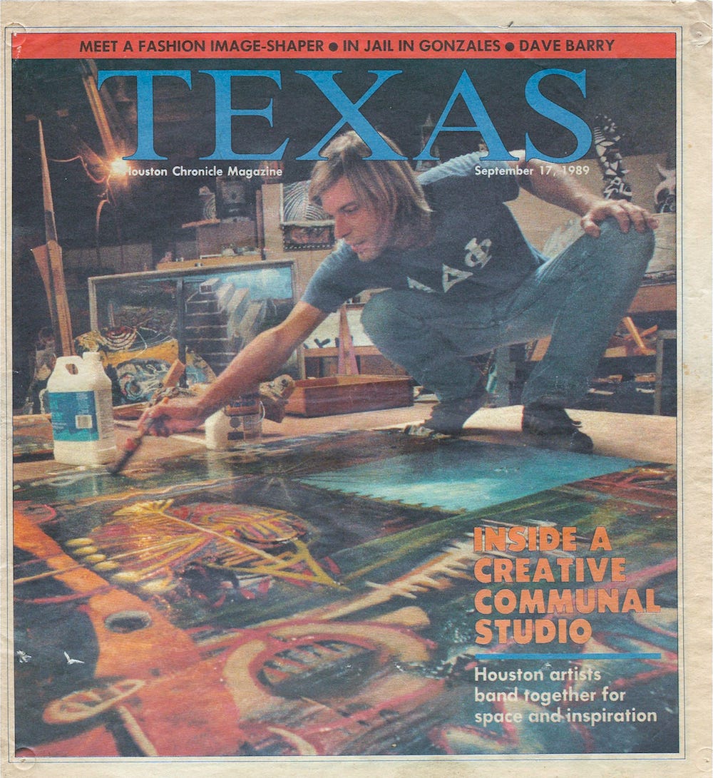
This photo is from Texas Magazine published by the Houston Chronicle on September, 17 1989 and was taken by Paul S. Howell. It is obviously not used with permission.
WES HICKS: Robert Campbell was definitely the patron saint of Commerce Street. He saved Commerce Street. Danny, I can't remember his name--he'd owned an art gallery that had shown my work and he was a collector of mine. And he connected Robert Campbell with us. A lot of my friends like Paul Kittelson, David Kidd, Jackie Harris--they were kind of all bailing on the project and never actually got involved. All the people we were counting on to populate this space from Lawndale had other plans. The whole thing was going to go bust, then Robert Campbell walked in and just had the faith in us. He changed everything. He saved the place.
BOYD: OK. What kind of art did he do?
HICKS: He was very eclectic. He was very religious. He was at the time wanting to become a priest in the Catholic Church. They told him that they thought that wasn't a good idea because he'd have to spend years studying, and with his medical skills, he could just become a devout Catholic and help the church work in Central America. And would be better than him becoming a priest. All that sounds crazy.
Robert was very... I don't know how to say it. It was like hanging out with a Buddhist monk or something. He was a really calming spirit at a time when me and Kevin and Deborah and all those other people--we were pretty wild and prone to real emotional situations. Robert could calmly come in and calm things down. I'm not sure how it all would have gone forward in the early days without Robert Campbell. Pretty soon after he got there, he found out he had the AIDS virus. Then it was sort of downhill for him from there.
BOYD: What about Deborah Moore. I know she was your girlfriend, right?
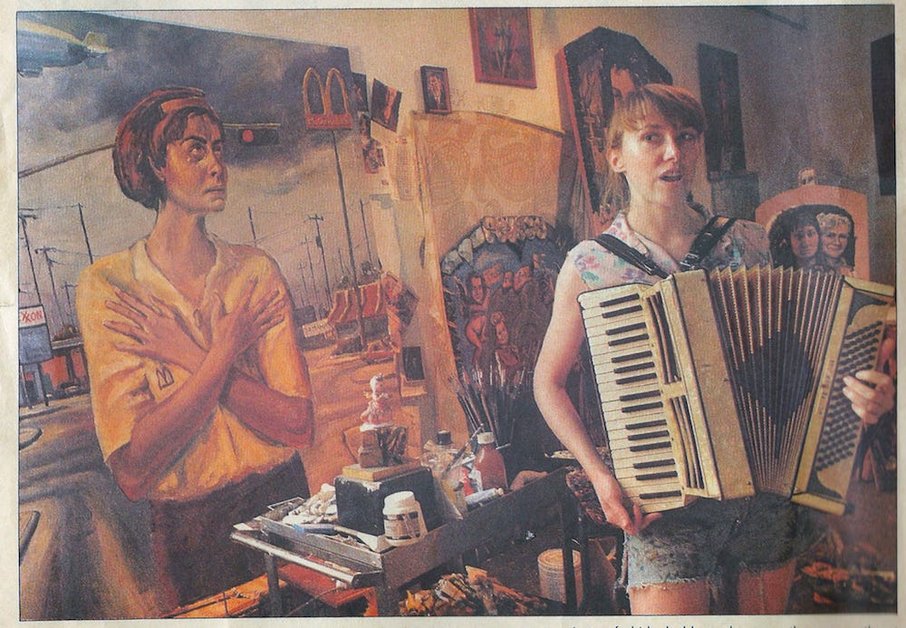
Another photo by Paul S. Howell from the Houston Chronicle. Deborah Moore and her accordion.
HICKS: Yes, she was my girlfriend. I met her through Kevin and Jane at an Urban Animal party. She was this little Urban Animal skatepunk who when I first met her. Full of safety pins and stuff. Hair cut like one of those English models from the 1960s. With a purple streak or something in her hair. I just fell in love with her immediately. I was at her apartment in the Heights one day and there was this incredibly technically-proficient sailboat painting on the wall--quite a large one. I thought it was a photograph, but then when I looked at it, I could see it was a painting. She said she painted it. You can paint like that? You know that much about painting that you can paint that realistically. You could learn from us some other things about painting. You should be an artist! Oh, OK. I always wanted to be an artist. It just went from there. Her role at Commerce Street was she was an incredibly sound business minded person. She took care of the business.
BOYD: I know she was the treasurer, which meant collecting the rent and paying the bills while she was there.
HICKS: She was highly responsible. Deborah was an incredibly responsible human being. And very strategic. And her father was a lawyer--she was working for her father at the time as a legal secretary. She brought all of that expertise with her. That solved all our problems because I had no idea about any of that stuff.
She understood contracts, leases, lawyers. And she wasn't shy about dealing with any of that stuff. Not that there was that much to do compared to what there would be today. Looking back at it, it was all really simple stuff. You get the power bill, you paid it. One of that was really difficult stuff. Even though I could do it, but I was never really the type of person--a steady person like that.
BOYD: How about Kevin Cunningham. He was someone you knew from Lawndale, right?
Kevin Cunningham from the 3-Legged Dog web page. Photographer unknown.
HICKS: Kevin was like my best pal. He's a great guy. He's a real theoretician. He's a great reader and was actually better read that anyone else at Lawndale. The truth about Lawndale was that everybody was a practicing artist there. Surls and Dougan and Moira Kelly--the people who ran Lawndale--most of our teachers like Derek Boshier... it was all hands on. We talked about philosophy and art theory and all that, but there was a distinct anti-intellectual streak at Lawndale which Kevin and I were on the other end because we did like to read and we did read like James Joyce Ulysses and we did want to talk about that. At parties, other friends would laugh at us. So that's what Kevin and I... were really into the world of ideas. That's probably why he stuck around with me. Commerce Street was a big conceptual project from our point of view.
Kevin wasn't there very long. He was only there for about a year. He couldn't make his rent. We probably did have disagreements about the performance bay and the quality of artists we were letting in. I had a very bad take from the Lawndale experience. Basically, if you wanted to be an artist, and you were really committed to it, it wasn't for me to say, oh, do you have a degree? What do you know about art? It was really more about your degree of commitment. Kevin was more about set standards, maybe only let grad students in. And things like that. We probably disagreed about that. We also disagreed about the use of the space. I'm not sure if Kevin left because of disagreements or because of the direction he was moving in, which was towards literature and theater.
BOYD: He told me he moved to New York because Edward Albee and Donald Barthelme said, you're not going to make it as a writer in Houston.
HICKS: There was a lot of that to it.
BOYD: Next on my list is Rick Lowe. You say he was there pretty early on. He must have just showed up in Houston, right?
Nestor Topchy (left) and Rick Lowe (right) transporting some art to a gallery in 1990. Photographer unknown.
HICKS: Rick must have heard about it and he showed up. That was one of the things Kevin and disagreed with is because Rick didn't really have an arts theoretical background, there was some disagreement about whether Rick should be allowed in. I think that's what Kevin and I disagreed on because I thought Rick was committed enough. And wanted to have go at it, and it was all about getting people to go.
BOYD: Steve Wellman. Who is he?
HICKS: Steve Wellman is like my best friend in the world and always has been. We met at Lawndale. He was just painting. Everything about painting we agreed with. We started this thing where he would paint a picture and I would be jealous of how good it was so I would paint the same picture, only better. [laughter] And he would go, you know, I can paint it better than you, so we drove each other all the way through university. By the time we were in our last year, we were collaborating not directly on canvases but in a whole way of thinking about painting and art. Basically we felt like we were developing a universal language that crossed all the arts--music, theater, painting, sculpture. We were looking forward to kind to a kind of multi-media future. We didn't know anything about computers. We saw a future where there was a multimedia super-art form, kind of like the glass bead game--Herman Hesse's Glass Bead Game. We were real soulmates. I really was broken up when he didn't get involved with Commerce Street. It makes perfect sense because he's a kind of private person. He was not going to paint in a big public space with a bunch of hooligans all around us.
He shared a studio with Kevin Cunningham. But he never was able to really get into working there. It was too far away from the Heights where he lived. He had to ride a bicycle back and forth. It just didn't work out for him. The way Steve worked was very private. Very quiet. Commerce Street was developing in a direction that was very loud because you had this big open building and a lot of people coming and going. If you weren't able to deal with distractions, Commerce Street was going to be a hard place to make work.
BOYD: How about Carolyn Florek?
HICKS: She built one of the first spaces in the front of the building. She was a very important very important figure painter. She never lived there. I don't know how long she was there for--maybe two years? Three years? She was an important pioneer. A lot of people--Marci Hardin: do you know that name?
BOYD: Yes.
HICKS: Marci Hardin, yeah. Marci Hardin and Carolyn Florek were two people who built out two of the first spaces in the front of the building and kind of defined how the walls were going to go, the standards for the doors. The standards for the electricity run through the spaces. They were real important in that sense regardless of what they were doing artistically in those spaces.
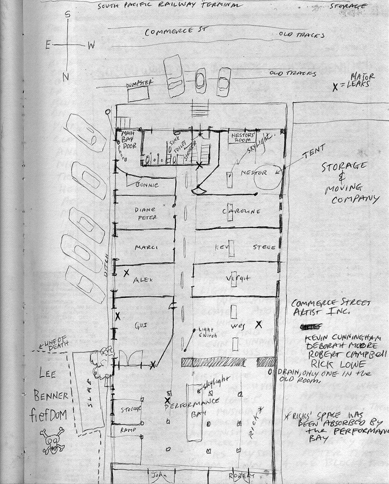
Hand-drawn floor map from October 21, 1986
BOYD: She was there right the beginning--from close to the beginning in 1985.
HICKS: She would have been one of the first tenants, after the five of us formed the corporation. And Marci on the other side. If I had my diaries still, I would have all this stuff. But I don't have it with me. James Bettison was fairly early on, too. Virgil Grotfeldt was really early on. He built a space next to Carolyn's.
BOYD: He was older, right?
HICKS: Yeah, he was an older guy. Rick and I knew him... his wife Deborah was involved with Diverse Works in some capacity. I can't remember what exactly. She wasn't quite the director, but she was working pretty high up at Diverse Works. Virgil had a house painting company and Rick and I worked for Virgil.
BOYD: Let me ask about Nestor Topchy.
This is Nestor Topchy in 2014. Photo by Robert Boyd
HICKS: Yeah, Nestor rolled up. He was sent to us by Moira Kelly. He moved from Baltimore to be a graduate student at UH/Lawndale. When he came down, his parents gave him a station wagon. He put all his stuff in it. He came down to Lawndale and didn't really have anywhere to live, so Moira Kelly pointed him over to us. We gave him some space in the front of the building and it took off. Nestor is one of those guys who gets up in the morning, has art for breakfast, art for lunch, art for dinner. Just a maniacal worker. He had a great time at Commerce Street.
BOYD: There's a guy named Mike Scranton--is that correct?
HICKS: Yeah. Mike Scranton was a sculptor who took over Nestor's studio when Nestor moved out to start Zocalo in the Heights. And Mike Scranton moved into that space and occupied it for well into the 90s. Lee Benner has made some videos about Mike Scranton. I don't know if you've seen them.
BOYD: I haven't.
BOYD: It seems like there were a whole bunch of painters in there.
HICKS: There were a lot of sculptors, too. And a lot of performance artists. A lot of the performance artists and musicians never had spaces there. They just came there. A lot of times, some of them like Kevin Jackson for instance--have you ever heard of him?
BOYD: Yeah.
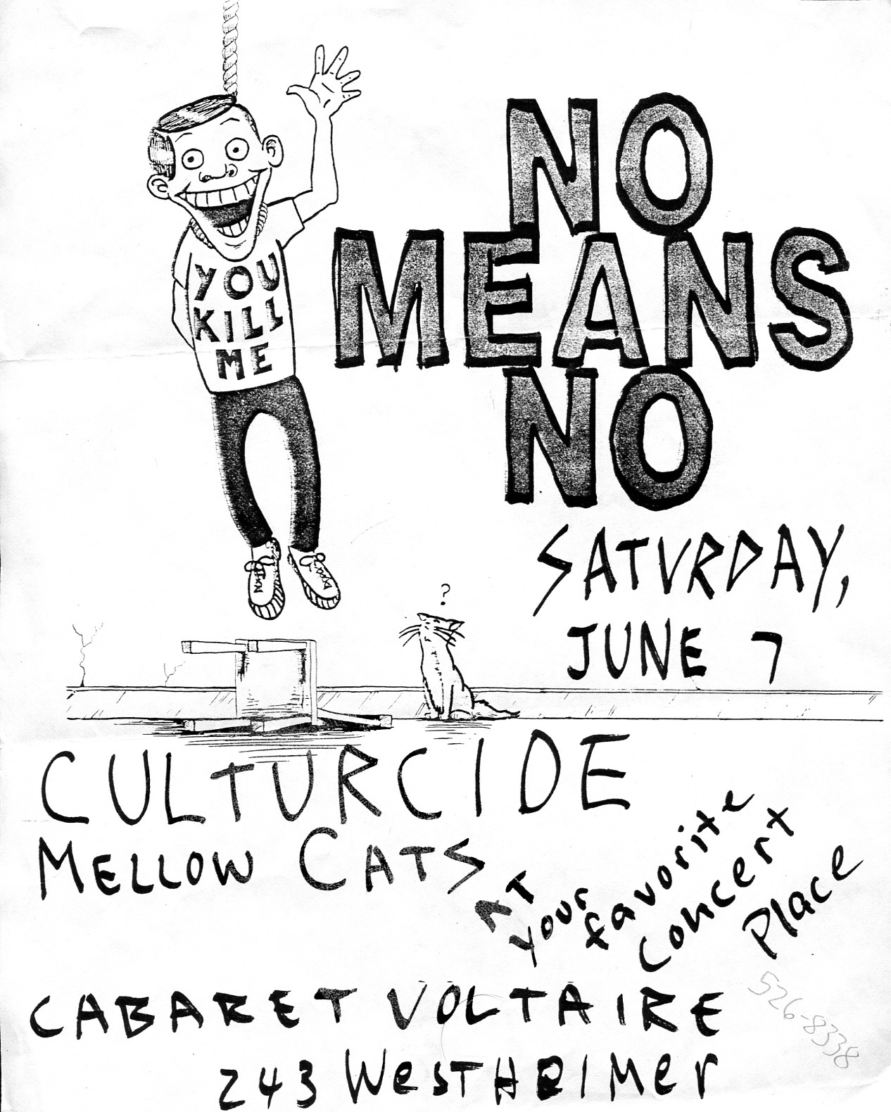
Cabaret Voltaire flyer, featuring Culturcide, Perry Webb’s (aka Mark Flood’s) band
HICKS: He was in a band with Deborah. He also about the same time. I think he was running Cabaret Voltaire, which was a little kind of punk offshoot alternative music scene place kind of around the corner from Commerce Street on the other side of the railroad tracks. Kevin was really instrumental in a lot of the things at Commerce Street. Things like lighting, electrical problems, sound issues. Getting us totally in-tune with what the latest stuff going on in the alt-music scene. There were a lot of people like that didn't have spaces in Commerce Street but who were really important.
BOYD: John Calloway?
HICKS: John Calloway moved in fairly early. He's a friend of Lee Benner's originally. Now we're pretty good friends. He's an art collector. He owns his own oil company (or did).
BOYD: Was he the one who was trying to teach himself how to be a marble sculptor?
HICKS: Yeah. He was a really interesting character because he imported tons of marble from Carrara, Italy. Giant blocks the size that Michelangelo would have loved to have had. And the same quality, too. He had a helper called Dan, who we called Dan the Man. He was an ex-Marine, but you would have never guessed it, because he was such a lovely, light-hearted roly-poly little fellow. You would have never guessed he was trained to be a marine sniper or whatever. He lived in John's studio with all these giant marble blocks from Carrara, Italy. I'm smiling. It was a real unusual situation. It was really interesting. It was fun.
BOYD: What about James Bettison. When did he show up?
HICKS: He showed up only like about six of seven or eight months after we were going.
BOYD: So that would be 85 or 86, right?
HICKS: There was this kind of wave of artists, especially female artists with Marci Hardin, Carolyn Florek, and I think there were one or two others. And these people were fairly gentle, quiet people. They wanted a place to paint and the way Commerce Street was going with sculptors moving in and the performance bay being a big music, loud, performance scene. I don't think it fit them.
BOYD: One of them would be Liz Ward, right?
HICKS: Oh, yeah. Liz Ward would definitely not have fit in well with Commerce Street because of her quiet, introspective nature.
BOYD: According to my notes, she was there for at most a year.
HICKS: Yeah, she was, but it didn't work out for her. I don't know why, but I bet, just knowing Liz personally, it was too loud.
BOYD: What about Mark Flood.
HICKS: Mark Flood was Perry Webb.
BOYD: Perry Webb, right.
HICKS: Perry Webb was not a shrinking violet so he was quite capable of handling the punk scene.
BOYD: Yeah, he made plenty of noise himself. He had a studio...
HICKS: Yeah, he did a lot of work there, and across the hall from his studio when Virgil moved out, he took over Virgil's space and turned it into a little gallery that he called The Screen Door, I think. Because it had a screen door on it. And he curated shows there of his interests. He did a lot of his own shows there. A lot of early shows of "Eat Human Flesh"--his first show of that and things like that. And that was a really great addition to Commerce Street. We could hang art up and down the hallway and hang art in the performance bay, but we didn't have a white wall gallery with lights and everything. He did all that. Actually, we adopted that space ourselves. He wasn't paying rent on it. We turned it into the gallery space at Commerce Street.
BOYD: Michael Batty? I know he wasn't at Commerce Street, but he wrote about Commerce Street.
HICKS: Michael Battey was at Commerce Street a whole lot.
BOYD: One of the hangers-on.
HICKS: I don't think of him as a hanger-on, because I think there were the people who added a lot of vigor to the place. They did stuff. Michael Battey was one of the people that...
BOYD: Did he have a studio?
HICKS: No, I don't think he did have a studio. I don't think he was into studio art at the time. He was a writer.
BOYD: He wrote a lot.
HICKS: A lot of these guys like Michael Battey were pivotal in bouncing ideas off and thinking about the way a show should go. The intellectual atmosphere that surrounded the place was completely enhanced by characters like Michael Battey. I have pictures of him in the hallway sitting around with me and Jim Pirtle and Nestor and Rick Lowe. Pirtle standing with his little polyester shirt paintings and everyone drinking heavily and talking. Who knows about what, but we were talking.
BOYD: What about Malcolm McDonald?
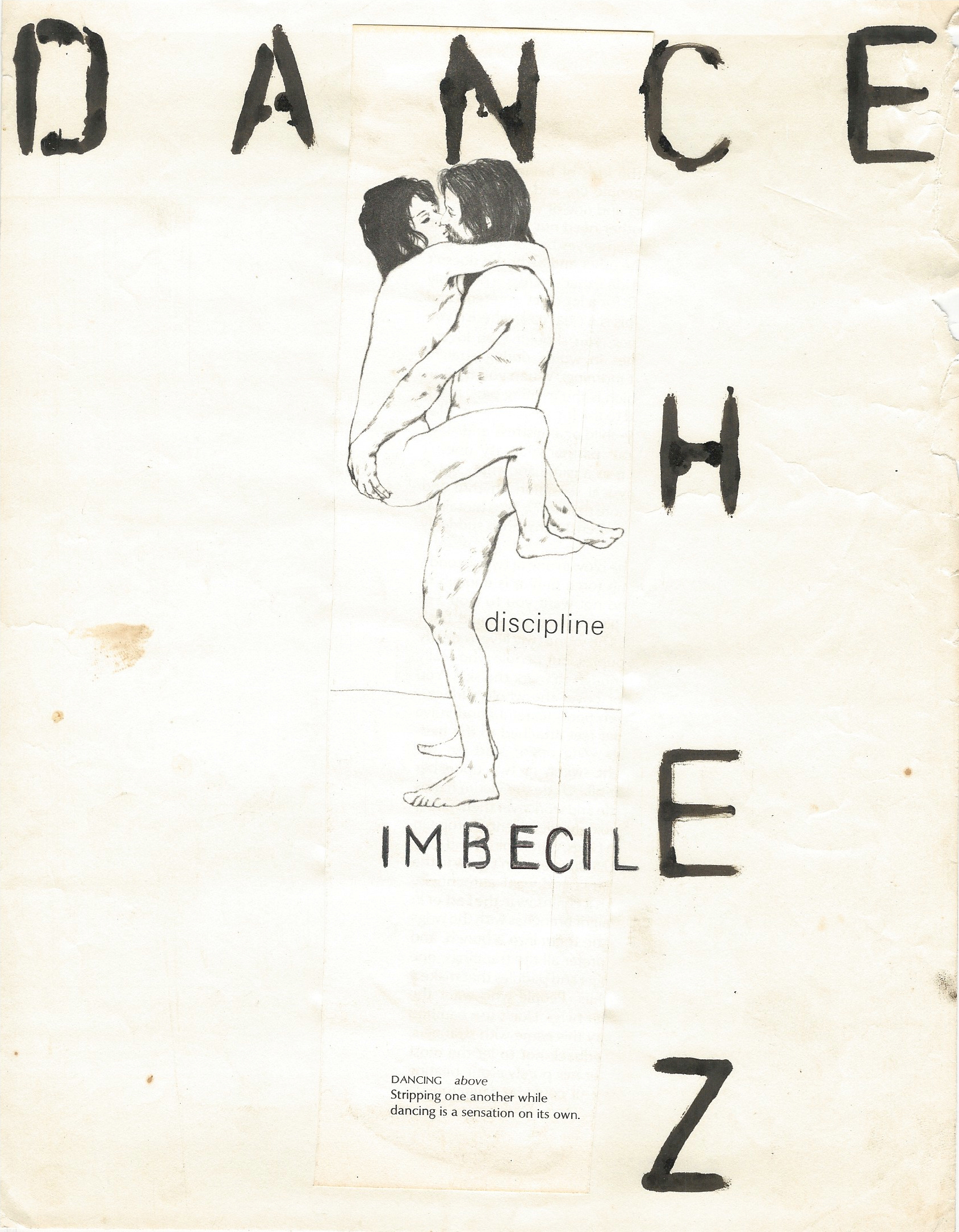
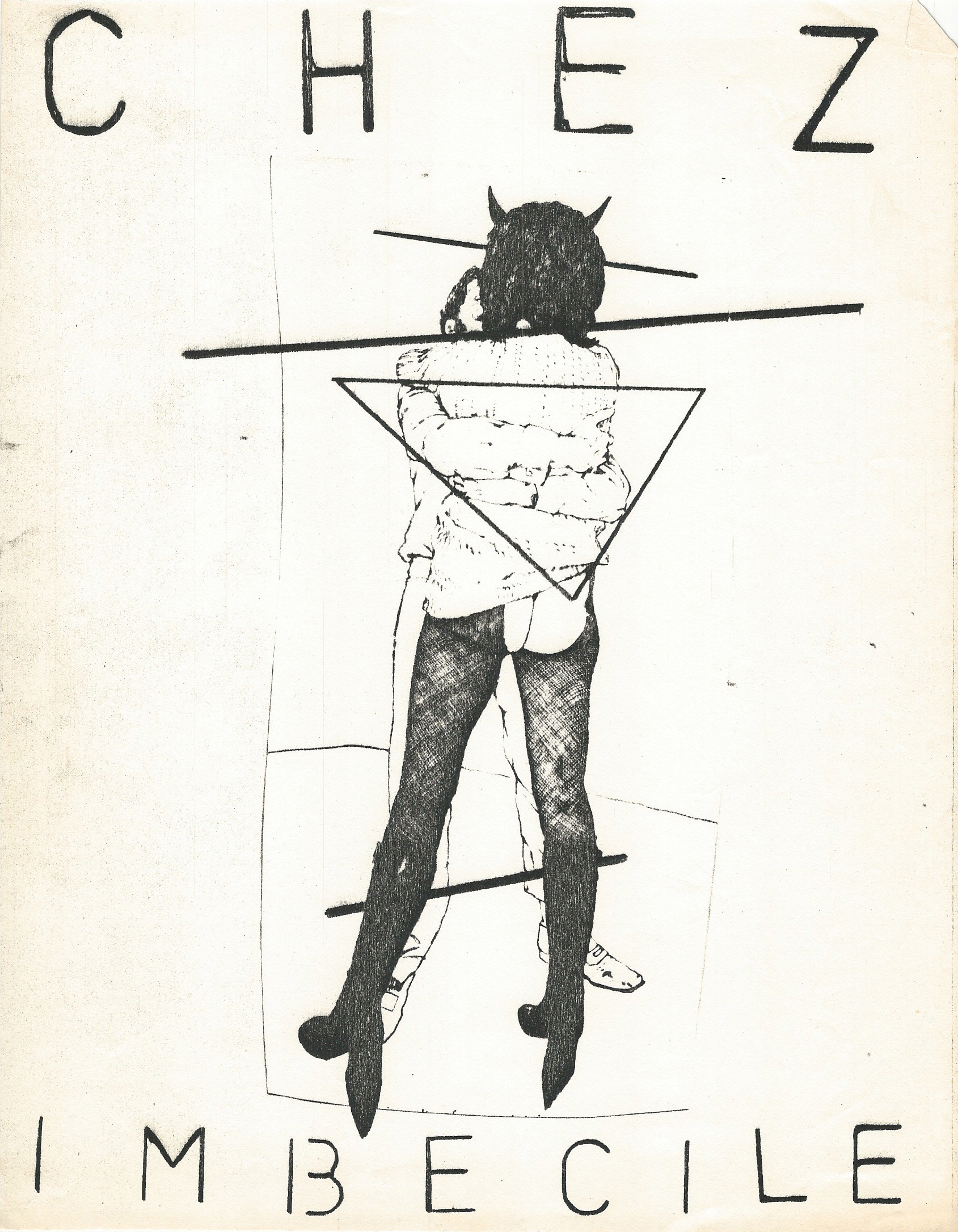
HICKS: Malcolm McDonald was so pivotal to Commerce Street that you can't tell the story of Commerce Street without mentioning Malcolm. He created Chez Imbecile with Robert Rosenberg.
BOYD: Also known as Chef Bob.
HICKS: Chef Bob. Robert Rosenberg and Deborah Moore. That was a really important step because they gave me a reason to say that the Performance Bay was working. Chez Imbecile was kind of the first regular thing that went on there, and it brought in tons of people to see the space. Basically, it made a name for CSAW. ZZ Top showed up.
BOYD: Really?
HICKS: Yeah, with their beards and everything. They just swanned in one night--or several nights. Billy Gibbons came back a couple of times, I think. They put the Performance Bay and Commerce Street on the tourist map for people from the right side of town.
BOYD: Chez Imbecile--what was their deal? Were they doing performance, or what?
HICKS: It was kind of like taking off of modern theater in a sense. It was a restaurant that served spam. Then there would be various performances and dancers and music. The audience was in the middle of it. There wasn't really a defined break between the audience and the show. You were in it. If you came there, you were part of the show. People tended to come there to show off. Some of the performances were planned, and others, people would show up and just do their thing. It was very uncontrolled. And there was also this whole thing with Malcolm. He was a very volatile figure, as you've probably heard. He would lose it occasionally. That became part of the performance, too. It was a pretty amazing dada-istic, fluxus, all that stuff. It was way out there. It was always something to talk about until next week.
BOYD: Was he a visual artist at all?
HICKS: No, I would say he's an MC. He was like an MC.
BOYD: How about Jack Massing. He was there, right?
HICKS: Yeah, Jack came in. He was one of the original people I wanted to come in but he didn't come in with us until later. He built a little, tiny cube space in the performance bay. It was probably only 40 x 40 feet. It may have been smaller, 30 x 30. The ceiling was 20 feet high. He built a little loft in there and Jack filled it with all of his gadgets and little sculptures he was doing at the time. It was really beautiful. One of the most visually, esthetically pleasing studios in the whole space. And Jack used the Performance Bay and did some really amazing performances there. The one I remember the most, they got maybe 100 or 50 truck springs, suspension springs from 18-wheelers and they dropped them out of the ceiling, which was really high. Like I said, it could have been 22, 23 feet. And the springs would hit the concrete floor and then they would bounce madly in all directions. And he did this with an audience of about 50 people standing around in a circle. And some of these truck springs weighed 50 lbs. [It was an Art Guys performance call 50 at Once] If anyone had been hit, they would have been wiped out. I don't know how he rationalized it that he could actually do that to an audience. But he did and it worked out great, and it was one of the most amazing things you've ever seen. The sound and the visuals--it was pretty incredible.
BOYD: You wrote several articles for the Public News. How did that come about?
HICKS: I wrote a lot of articles for them actually because I had always been interested in writing. I was writing the whole time I was at Commerce Street. I have a daily diary. It's real spotty and kind of intimate and probably real whiny. It represents the voice of an immature whatever age I was then. {laughs] Anyway, it would be fun to look at it again. I just kind of gravitated towards the editors of the Public News and said, yeah sure--I'll write for you. They aren't paying anything, I don’t think. I started writing criticism of art shows.
BOYD: I read your review of Fresh Paint, which to me is sort of the end of a certain era in Houston, when painters were the most important artists there were.
HICKS: I kind of figured I was out of my league writing about art, plus you can't write bad reviews of people you are going to the next art show and hanging out with because they'll hate your guts. I started writing music reviews and stuff like that.
BOYD: How involved were you with music, with rock bands and so on.
HICKS: I just kind of hung out. Like I started hanging out at the Island when the Dead Kennedys were playing there in 1981. When we were running Commerce Street, I got to know J.R. Delgado of the Axiom pretty well.
BOYD: I went to the Axiom back in those days.
HICKS: Commerce Street was really close to the Axiom; we moved our crowds back and forth between them sometimes, like there'd be a late-night show at the Axiom after an art opening at Commerce Street. We collaborated on things. I think that the poetry slam that J.R. did with Rebecca Johnson while Commerce Street was still going, I think that may have had something to do with people at Commerce Street because we all participated heavily. I don't know if J.R. would have thought of a poetry slam by himself because he was more of the music scene than the art scene. And that was a really big success for the Axiom. Wednesday night poetry slams would pack in 300 people--heavy drinkers--all night, they'd actually throw people out at 2 o'clock in the morning on a Wednesday night. It was great. So anyway, I got into that and J.R. said, look, I'm getting out of the business; this is a big opportunity for you. You should jump in here and take over. You could do it. I said no. Actually, I thought about it but I just didn't have it together so some other guys took it over. They turned it into a real headbanger/heavy metal place.
BOYD: Was it still called the Axiom then?
HICKS: I think they kept the name the Axiom. They only lasted for like six months. Then they lost their lease because they were so inept. They just drove it into the ground. And it was just like an empty building with a shingle hanging out front and J.R. was just, "Somebody's got to do this." So I pulled together some investors for not very much money, so we went in there and gave it a go.
BOYD: What year was that? That was when Catal Huyuk began? [A little research shows that it opened November 3, 1992 and closed a year later]
HICKS: Yeah. I'm not sure what year it was either. We were really communicating with Public News. It could have been 91 or 90.
It just rolled on. We were open like 7 nights a week. We hardly ever closed for holidays or anything. It's just all one big huge blur to me. It seemed like it lasted six months but before we turned around, it lasted three years or something.
BOYD: Why did you pick such an obscure, intellectual name as Catal Huyuk?
HICKS: That was probably a huge mistake.
BOYD: [laughs] It's interesting that you picked the oldest--that along with Jericho are the two oldest human habitations or human towns, I guess. And that's interesting, I guess.
HICKS: We saw that what was going on at the Axiom really came from the Island--have you heard about the Island? It was in Montrose right next to highway 59 and Westheimer. I believe (I'm not an expert) that the Island was the first punk club in Houston. It started in the 70s. And that's where the scene started. Then it kind of moved finally. I don't know what happened to it, but you know it's gone. That whole scene moved out to the Axiom which was there for who knows how long. So Catal--we felt like we were building on its ruins. You know how those ancient Turkish towns how there are layers and layers of building that built up. All this history. We were just the latest layer on top of that.
BOYD: OK, that's a good reason to name it after the oldest town in the world.
HICKS: And we thought that punk music and this art thing that we were doing was connecting into this primal, Mother Earth thing. Phil Bergeron, the guy who started the club, was my main business partner--were deeply influenced by James Lovelock's Gaia hypothesis at the time. And Joseph Campbell. Hero of the Thousand Faces. We were just really living that stuff.
BOYD: I want to talk about leaving Commerce Street. I have a letter--I have no idea if it was ever sent to you--from 1994. It's an eviction letter. I don't even know who it was from, except that it is apparently from people at Commerce Street.
Wes Hicks painting. Photo by Paul S. Howell.
HICKS: What happened is that Deborah left Commerce Street.
BOYD: In 92, I think.
HICKS: She ran off to New York with David Kidd and basically dumped me. I was heartbroken. That's when I met Phil Bergeron. He started Catal Huyuk, and then I got involved in Catal Huyuk and running Commerce Street. Catal Huyuk was a seven-day affair that was actually a business and Commerce Street all fell onto me to run the business side of it, too. To create the bills and stuff. Basically, all the people who at the beginning at Commerce Street had already moved along in their lives and all these new people came in. I was a mess, basically. I was doing so much stuff with the music scene over at Catal. I wasn't doing much painting--zero painting. At one point, I was so confused I tried to go back to art school to study art history. That didn't work out either. Then I had a collapse. It just all collapsed. They evicted me. That's what everybody wanted. It was time. It was time to go. I should have actually gone when Deborah left. I wasn't mature enough or I wasn't focused enough. They made a go--it lasted how many years after that?
BOYD: Until 2007.
HICKS: That's right. They didn't need me anymore. I should have had the smarts to get out of the way, but I didn't. And part of it was that I'd been there so long that I had the 4 or 5 thousand square foot space full of stuff. I was suffering from pleurisy on and off. I was sick a lot. I just couldn't handle it.
BOYD: What did you do after Commerce Street.
HICKS: I moved to the Heights for a little while. Then I got a job as chief preparator with Laguna Gloria Museum in Austin, Texas. I moved there, and then I got involved Tim Adams making animated computer stuff. Thought that that was the greatest end-all be-all deal And Ken and I worked on some projects for...I can't remember his name...This guru... Terrence McKenna. We became Terrence McKenna followers. Then I got involved with the Apple corporation in tech support. There were all these internet startups, we were playing around with that. Then I eventually found Donna in Australia and moved out here.
BOYD: How did you end up in Australia?
HICKS: I'd lived overseas when I was a kid in Indonesia. I was raised in Indonesia. I went to high school at the Joint Embassy School in Jakarta Indonesia. Actually, I went to the same school in Indonesia as Barack Obama. But he was so much younger than me that I never knew him. Then I had an Australian girlfriend named Donna Bryant, then I reconnected with her online and we had a good internet romance and I came out here and never went back.